A Motif on Paper or on Cloth: What Changes with the Medium?
See how the same repeated motif changes on paper and cloth, so you can choose the medium that best suits the viewer’s attention and setting.
Should a repeated motif go on paper or cloth? The answer depends on where someone will see it, how close they can come, and whether their attention should rest on one carefully framed area or move across a larger field. A printed page and a piece of fabric can carry the same motif, yet they do not ask to be looked at in the same way.
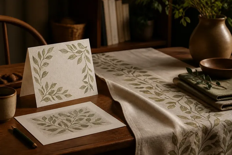
Imagine a maker adapting a small leaf pattern for a folded paper card and a cotton table runner. On the card, the leaves might gather around a greeting; on the runner, they might recur along the length. Neither treatment is inherently more faithful. The medium changes the motif’s scale, rhythm and relationship with its surroundings.
Choose by viewing situation
Start with the encounter, not the pattern. Is the motif meant to be studied in a quiet pause, noticed while someone passes, or seen as part of a larger arrangement? That distinction often points towards the right surface.
- For close reading: Choose paper when small details, captions or changes in line deserve attention. A page gives the eye a bounded area and a natural place to begin.
- For a room or shared table: Choose cloth when the motif needs to be seen across a space or alongside everyday activity. Its repeat can remain visible even when people are not studying it directly.
- For a single, framed moment: Paper suits a design whose meaning depends on a particular grouping or sequence. The edges can keep that grouping intact.
- For a long or changing view: Cloth suits a motif that can recur as someone walks past, sits down or turns the fabric. The pattern may be encountered in fragments rather than all at once.
These are tendencies, not rules. A large sheet can be viewed from across a room, while a fabric sample can be held close. What matters is the likely distance and movement, not the material’s name alone.
Paper holds the frame
A page makes a strong promise about where to look. Its edges create a frame, and a margin can give a motif breathing room. If a repeat sits in one corner, surrounds a title or runs along a border, the reader can take in that relationship without having to search across a larger surface.
That bounded view is useful when the pattern has a focal point. A printed page can place a cluster of leaves beside a short note, for instance, or show how a line of shapes changes from one panel to another. The reader can pause, compare and return to the same arrangement. Captions and labels can also sit close to the motif without competing with an expanse of pattern.
Repetition on paper often feels deliberate because the viewer can see its limits. A row that begins at the left edge and ends near a heading feels different from a repeat that appears to continue beyond view. Cropping, white space and page turns all affect the perceived rhythm. A motif repeated on facing pages may suggest development; the same motif repeated within a single border may feel contained.
Paper can also make a motif seem more like an image to interpret than a surface to live with. That is not a flaw. It is a useful quality when the goal is concentration: the design can be examined without the folds, drape or changing orientation that fabric brings.
Cloth spreads the rhythm
Fabric is rarely encountered as a perfectly flat rectangle. It hangs, folds, bunches, stretches over a table or moves with a person. A repeated motif therefore meets the eye in changing sections. The viewer may see a whole arrangement from a distance, then notice only a few shapes nearby.
This makes scale especially important. A motif that seems delicate on a small paper proof can become visually faint across a curtain. A dense repeat may feel lively on a cushion but crowded when extended over a larger area. Consider the usual viewing distance and whether the fabric is likely to be seen all at once or in passing.
Cloth also gives repetition a bodily and spatial quality. A pattern may continue around a hem, across a sleeve or along a table’s edge. Its rhythm is shaped by seams and folds, as well as by the distance between motifs. If the repeat must align across joins, the pattern’s placement needs to account for those interruptions rather than treating the fabric as an uninterrupted sheet.
Movement shifts attention. On a hanging panel, a viewer might notice a vertical trail; on a cushion, the same motif may read as a compact cluster. The material’s weave and texture can soften fine marks or make a simple shape feel more tactile. These qualities invite looking at the motif as part of an object in use, not only as a design isolated for inspection.
Scale and repeat choices
When adapting one motif to both media, keep its recognisable character while changing how often it appears. A repeat is not just the same unit copied across a surface: its spacing creates pace. Close spacing can make a field feel busy; generous spacing lets each motif register as a separate event.
On paper, a maker may choose fewer, larger motifs to preserve a clear focal area. On cloth, the maker may use a smaller unit repeated across a longer span so the pattern holds together from several viewpoints. Or the reverse may suit the design: a bold repeat on a poster can be read from a distance, while a single enlarged motif on a fabric panel can reward a close look.
Say a maker is adapting a simple crescent shape for a folded invitation and a cotton scarf. For the invitation, they place a small group of crescents around the central message, leaving clear space for the text. For the scarf, they enlarge the gaps between repeated crescents and keep the repeat clear near the edges. The expected observable result is that the message remains easy to locate on the page, while the scarf’s pattern can be recognised as it drapes rather than only when spread flat.
A useful comparison is to make a paper mock-up and a fabric-sized drawing before committing to the final arrangement. Mark the intended viewing distance, then step back from the paper or hold the drawing at the scale of the finished piece. This does not reproduce cloth’s texture or movement, but it can expose a repeat that looks too tight or a focal motif that disappears when viewed from farther away.
Which medium fits your aim?
Which medium suits a detail-led motif?
Paper usually suits a motif whose linework, small variations or relationship with text needs close attention. Its frame helps keep the viewer’s gaze in one place, although a large fabric panel can work if the design is scaled for viewing at a distance.
Which medium suits a pattern seen in passing?
Cloth often fits better when a motif should recur through a room or accompany movement. Its shifting folds mean the repeat should remain legible in partial views, rather than relying on every unit appearing together.
How should I choose the motif size?
Begin with the distance at which the surface will normally be seen. For a page held nearby, finer marks may be clear; for fabric viewed across a room, stronger shapes and more open spacing may be easier to read.
Can the same repeat work on both?
Yes, but the layout may need to change even if the motif itself stays recognisable. Adjust its size, spacing and placement to suit the page’s frame or the fabric’s folds, seams and likely viewing angles.
Keep the motif recognisable
Adapting a motif does not require making the two versions identical. Preserve the feature that lets viewers recognise it, such as a distinctive outline or repeated colour relationship. Then let the medium determine how that feature is arranged. On paper, it may sit in a clear sequence; on cloth, it may reappear as a more open rhythm.
Check the finished design in the setting where it will be seen. A page can be laid beside its accompanying text; fabric can be held up, draped over a chair or viewed at the distance it will occupy. Notice where the eye lands first, whether the repeat holds together, and what disappears in a fold or at an edge.
For a motif on paper or cloth, the better choice is the one that supports the intended kind of attention. Choose paper when the viewer needs a stable frame and room to inspect detail. Choose cloth when the pattern should share space with movement and be met in changing glimpses. That distinction can guide the layout without asking either medium to behave like the other.